Showing posts with label Analysis. Show all posts

Wednesday, 17 February 2016

Analysis of institutions that could publish my magazine


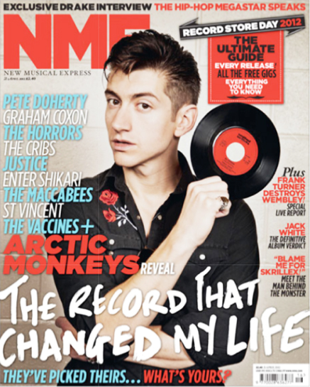
IPC Media now known as Time inc.UK. was founded in 1968 and is a publisher for magazines in the UK. The magazines they publish includes NME which is of a similar genre to my magazine. This company sells hundreds of millions of magazines a year and the fact that they distribute NME which has a similar target market to my magazine shows that they already have a product in that market and have experience there.
I believe publishing this Time inc. (UK) would be a good idea because they are a very succesful company which would help propel my magazine to the right audiences.


Bauer media is a huge publisher that joined the Bauer Media group in January 2008 following an acquisition of Emap plc's consumer and specialist magazines, radio, TV, online and digital businesses. They run a huge amount of radio stations, TV stations, websites and magazines. They own a number of very popular music magazines including Karrang! and Mojo. This makes me believe that Bauer Media would have no problem publishing my magazine to the right audience because they already have a huge amount of experience in that field.


Monday, 8 February 2016

Analysis of existing magazine titles


The DIY logo is very simple yet effective, it's black and white only colour palette makes it stand out. It has a bold font and all the letters in capitals, this makes for a very distinctive three word title. It draws the eye of the reader.
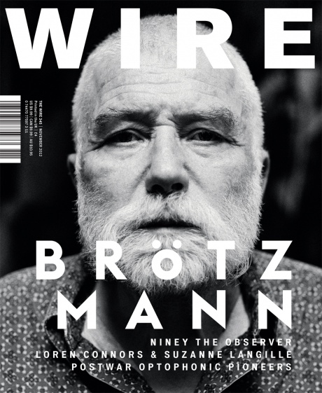
The logo of the Wire magazine is again very simple yet big and bold. It is used to grab the attention of the customer usually being placed over the picture of the main subject. Most magazines put the picture of the subject above the title but Wire does not do this. The title matches the simplistic style of the magazine with very limited colour in most of their covers.

The masthead of Loud and Quiet is very simple as most indie music magazine mastheads are. The name itself is associated with sound which is different to a lot of magazines which are either initials or nothing to do with music like The Wire. The masthead is in capitals and in a chunky font, it is always placed at the top of the page with nothing covering it and a white background.