

The DIY logo is very simple yet effective, it's black and white only colour palette makes it stand out. It has a bold font and all the letters in capitals, this makes for a very distinctive three word title. It draws the eye of the reader.

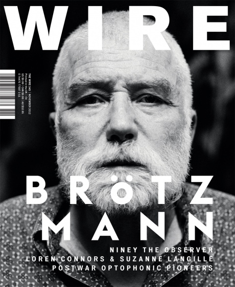
The logo of the Wire magazine is again very simple yet big and bold. It is used to grab the attention of the customer usually being placed over the picture of the main subject. Most magazines put the picture of the subject above the title but Wire does not do this. The title matches the simplistic style of the magazine with very limited colour in most of their covers.


The masthead of Loud and Quiet is very simple as most indie music magazine mastheads are. The name itself is associated with sound which is different to a lot of magazines which are either initials or nothing to do with music like The Wire. The masthead is in capitals and in a chunky font, it is always placed at the top of the page with nothing covering it and a white background.
No comments:
Post a Comment