Monday, 11 April 2016

Draft Evaluation 5

How did you attract/address your audience?

The front cover of a magazine is the main way that the magazine attracts people because it is what they see on shop shelves so it is the most important page of the magazine. It has to sum up the magazine and attract the right audience. I designed my magazine to be simple but bold so it is easily readable from a distance and there is not too much that would confuse or overwhelm a potential buyer. I saw in many indie music magazines such as Loud and Quiet or NME that they were simple but bold so I decided to follow that convention to attract the right audience. The simplicity is very different from mainstream magazines and would attract the right audience that enjoy being different and like different things. The image I used on the cover page also captures the eye of the possible reader because of the intense eye contact and the costume which would attract an indie audience. Overall I believe my magazine would attract the right audience well with all it's features and style.
Focusing on the masthead I got inspiration from 'Clash' another music magazine that uses a very bold font for it's masthead. I used this type of masthead because I believe the name of the magazine should be the most important thing on the page occasionally behind the subject of the main picture but in my magazine I decided that the masthead had to be the most important part which is because if it was published would be a new magazine and the name would need to be remembered by the audience. I decided to put a thick outline on the masthead to really emphasise it's importance, because the masthead is on a black background I decided to use only white on the cover page for the text this makes the mast head stand out even more.

The cover lines on my cover page are big and stand out because they need to be easily read by the potential buyer to see what is inside the magazine. I used white for all my text so it stands out on the black background and the dark green coat. The font I used (Rockwell) is great because it is a serif font and is more interesting than a sans serif font this is breaking convention because most magazines use simple sans serif fonts but I think it will attract more people because the target audience enjoys different products so this would cater to that need. I positioned my main cover line in the centre to grab the main attention of the reader
The main image of the model on the cover page is very important to getting the attention of the reader if not the most important. To cater for the target market my model is wearing a vintage style parka and his hair is styled in a stylish way with a small bit drooping at the end which is different and could attract the alternative audience. The audience may see the magazine as a way of looking for new fashions to aspire to so the costumes of the models are very important.

Contents page
On my contents page there are many different techniques I used to attract the attention of the reader. Firstly I put the most important things in yellow which makes the reader look there before anywhere else, I would assume they opened the magazine (if they are not regular readers) for the artist Beanboozled and his page number and title is highlighted as well as a badge advertising a competition for tickets to a festival which could definitely grab the attention of the reader. The amount of pictures I used are purely so the reader does not get bored with just text and are there for entertainment and to add to what the text says. The title of the contents page is inside a black box and then a white box which makes it stand out and look different to other magazines. I used a busy contents page to show the magazine is full of information and entertainment and not just sparse. Just by looking at this page the customer should be able to tell whether they want to buy this magazine or not so I made it very interesting and full.
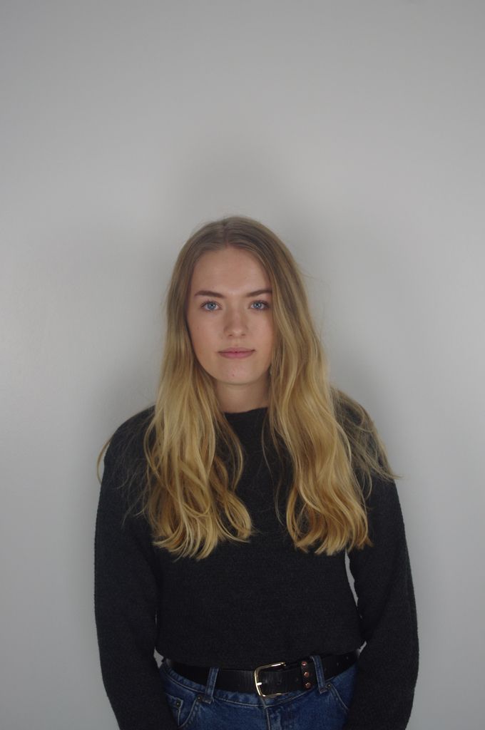
Double Page Spread
I got inspiration from Q magazine with the big watermark letter, I think this grabs the attention of the reader because it is unusual and adds some excitement visually to the page which would otherwise just be black and white text. My audience likes things that make magazines and everything different so this letter would make the magazine feel different and they would enjoy this. The title bending around the B is the same as it is unique and against convention. I am using the rockwell font again for the titles and the B and a simple sans serif font for the main body of the text following convention so it is easier to read. The serif font adds some art to the page making it more interesting. The picture on the double page has no eye contact which is not a problem as it is not the cover page. The style is simple just as the target audience like and may aspire to look like. However the framing on the picture has left too much white space which could be boring for the reader and that must be fixed. Overall my contents page would be considered interesting and the reader should enjoy it.


Sunday, 10 April 2016

Draft Evaluation 4

Who would be the audience for your media product?

My target audience is male and females between 16 and 25 because I believe the Uk tribes groups I have chosen to target only seem to be in this age gap. This age group is being targeted also because they look for alternative music and are more diverse than older age groups making them more interested in my magazine. They would enjoy finding out about new music and fashion in my magazine, the age range I chose also seem to have a big percentage who look for alternative music and it is more of a popular pass time to this age range than to others. My target audience would go to concerts, festivals and gigs which is again something only 16-25 year olds tend to do regularly although 16 year olds may need adult supervision still. People that go to gigs and festivals would be interested in my magazine because it as information on the latest gigs and festivals as well as information on the artists themselves. My age range ends at 25 because that is when most people tend to settle down and start going to less gigs and have less interest in the cutting edge music scene. I believe my magazine appeals to both male and female readers because the information is gender neutral and there is a variation of male and female artists and writers. Because my genre is indie/alternative my audience will definitely enjoy being/feeling different to others so they would enjoy reading about new artists. This also means that my audience may all have different styles so the magazine would have to vary the fashion a lot and make it it versatile in that sense. Due to the indie nature of the magazine and comparing to other magazines such as NME (£2.50) and i-D which (£6) I have decided to sell my magazine for £5. I decided to do this because of other magazine prices and because my magazine is quarterly which would greatly reduce income if I tried to compete with NME or other cheaper magazines.
The complete styling and design of my magazine was influenced by the target audience. From my research I found they like a minimalist look and for fashion they preferred an alternative look. This is why I dressed my artist 'Beanboozled' in an indie parka coat which would appeal to most of my audience. I also used a minimal style while creating my magazine because I found that is the most popular way for presenting indie magazines that appeal to the target audience.

I have made profiles for two possible readers and asked them questions as they would be the average people in my target market.


What would attract you to my magazine if it was in a shop?
Ben - The big bold masthead would draw my eye and the subtitle would then get my attention because the font is interesting. It would then have my attention and I would read the rest showing me whats inside and possibly persuading me to buy it.
Elliot - The picture of the artist on the front, the intense eye contact would draw my eye and make me look at the magazine because I would be intrigued and want to know whats inside the magazine.

What kind of artists and bands would you like to see in this magazine?
Ben - Honestly it doesn't bother me I just want to hear new music which is different to the norm. Anything that is new interests me whether they are a band or an artist.
Elliot - I tend to prefer bands because in the indie genre they are more interesting and tend to push boundaries more. I would prefer to see more bands for that reason.

Is fashion a big part of why you buy a magazine too or not?
Ben - Yes I always want to know what the next thing is and what is in fashion with popular bands and artists. I get most of my style from different artists because they always wear interesting new clothes.
Elliot - I am not very bothered about the fashion I just care about the new music however I still enjoy it I just would not buy a magazine for it.

Saturday, 9 April 2016

Draft Evaluation 3

What kind of media institution might distribute your media product and why?

The publishing aspect of media creation is one of the most important parts it arguably makes or breaks a media creation such as a film, magazine or video game. The distribution of my magazine should be to the right audience so that it is a success and it gets return customers. In my opinion what defines good distribution is if the magazine has a wide reach, sells a solid amount of magazines (this also depends on the quality of the magazine) and it professionally deals with any problems. My magazine would be distributed online and as a physical artefact, I would sell most of the magazines online and as subscriptions however I would also have a smaller amount in shops. In my opinion smaller magazines have a larger reach if they are online as well in online market places that is why I am choosing to only have the magazine in a limited amount of stores.

The companies that I could use to distribute my magazine are Time inc UK (formerly IPC media), Meredith, Bauer Publishing and many more. I would choose IPC media because they have a rich history in successfully distributing magazine and more specifically music magazines such as NME which is a very successful music magazine, this shows they have experience in the music magazine industry and are a huge company publishing magazines in general with them selling over 350 million magazines a year. A majority of the magazines they produce make money from the adverts inside them, this is how they would fund making the magazines and the route I think I should go down to get my magazine out there. I believe IPC is the best choice for my magazine as they are so successful they should in turn make my magazine successful by distributing it the right way. They already have experience with the genre my magazine is (NME) so they should not have too much trouble distributing it the right way to make my magazine as popular and successful as I would like it to be. In conclusion I would at this point want IPC to distribute my magazine.

Bauer Media is another possible for publishing and distributing my magazine, they distribute over 300 magazines and their parent company the Bauer Media Group are the biggest privately owned publisher in Europe. The sheer volume of magazines they produce shows they are successful and could be fantastic for distributing my magazine. An example of the magazines they produce is Q magazine which is a popular music magazine which is similar to my magazine. This shows they have experience in making music magazines in a similar genre to my magazine 'The Vine' which gives me confidence that they would make my magazine successful.

Friday, 8 April 2016

Draft Evaluation 2

How does your media product represent particular social groups?


From when I started researching for my magazine I knew what style and genre I was going for and I aimed it at certain social groups that typically enjoy the indie/alternative music scene. I decided to make my model roughly off of how Shawn Mendes looks because his clothing would be considered indie although his music is more pop even though the acoustic style is partly indie. I aimed my content at three groups from the website UK Tribes; the 'Hipsters', 'Trendies' and 'Young Alts'. I chose these groups because they all aspire to find the next thing; be different and all enjoy alternative music. The first group is the 'Hipsters' enjoy alternative music and enjoy fashion however they are not on the cutting edge anymore and are more mainstreamThe second group is the Trendies 'Trendies are driven by beautiful things and beautiful people, Trendies love fashion and are always looking for the next big trend!', this group would be interested in my magazine because of the new fashion shown by alternative artists in my magazine. Young Alts are described by the website as 'The Tribe who ‘want out’ of the Mainstream – an experimental Tribe trying anything and everything Alternative from Grunge to Hardcore… Young Alts are a long standing youth Tribe – the entry level Alternatives that simply want to set themselves apart from the Mainstream by looking alternative, listening to alternative music, having alternative views… Even if they are Mainstream in every other sense!'. I am targeting them because my magazine has alternative music which they would be interested in and also has alternative fashion that is relatable to them. From seeing this I saw when making my magazine I had to make my magazine the opposite of mainstream to attract these groups and present my artists in a way that is relatable and interesting to the groups.

The language I used in my magazine is definitely directed towards a younger audience, I used more slang words and abbreviations without it becoming too informal so that the magazine is relatable to the 16-25 year old audience. As a 17 year old myself I know how we speak and any lexical fields that would be associated with the indie music scene are also easy to get the hang of so the magazine represents the target groups well and they will therefore feel a connection.

Shawn Mendes is perfect for what I want because he is different to other artists and would attract the social groups despite his mainstream success. I decided that modelling my artist from how he is portrayed made my artist more relatable and interesting to the target market. I copied Mendes' style by using a parka that would be considered indie and then for the other pictures a simple knitted jumper which is also alternative and would attract the TMG. I represented the target groups with the mise en scene, for example the parka shows roughly what the TMG would wear. The hair cut the model has also represents the groups in a positive light with a neat yet stylish cut.

I have represented my artist Beanboozled in a relatable way to the audience so that he also represents them, the target market are 17-25 and the model fits into that age range perfectly so the audience can connect with him on a more personal level. He is represented as a confident, successful and stylish young man who the audience could aspire to be and even look up to. I did not want to make him too stylish so he was disjointed from the audience I wanted to make him as relatable as possible to the audience.

Tuesday, 22 March 2016

Draft Evaluation 1


In what ways does your media product use, develop or challenge forms and conventions of real media products? (i.e. of music magazines)

For the masthead of my magazine 'The Vine' I used the font Hattenschweiller which is already on the school computers. The font is very big and bold so that it captures the interest of potential readers, this convention is used very often with all magazines seen in shops. I chose to use the name "The Vine" because of a number of reasons firstly it is linked to the saying 'I heard it through the grape vine' meaning to hear something from someone that has been passed from person to person by word of mouth which could be confidential or secret, The Vine passes information about small indie bands and artists which justifies the name. The second reason is because grape vines have many grapes on them just as 'The Vine' has many different articles and different pieces of information. My target audience like to find new indie bands and artists so the name felt apt for them. My masthead is similar to magazines such as 'NME', 'The Fly' and 'Vibe' which are all also very big and bold and catch the eye of the consumer. My masthead is the second most obvious object on the page behind the main picture of the artist. I chose to make my magazine very simple to cater for my target audience who tend to like a minimalist look.
    

The graphology of my front cover is extremely simple. I only used three fonts one for the masthead; one for the subtitles and one for any other text. The fonts I use are Hattenschweiller, Rockwell and ________ they are all very simple but on a varying scale. The masthead font is very simple and bold; the subtitle font (Rockwell) is a serif font so is slightly more interesting and draws the eye of the reader; Finally I use the ________ font because it is a simple sans serif font that the reader will read after the masthead and subheadings. I used white for all my text on the cover because the background is black, this contrast makes the text pop out on the page which catches the eye of the reader. All of the information the reader needs to know is placed well and in white so that they can see it such as price, date and issue number. Next I placed the other information the reader needs to know, a brief show of the contents. This is placed towards the bottom of the page in a simple font that is practical and easy to read. This is so the consumer can see at a glance what is in the magazine, the artist's names on the front can attract people. The picture of the subject is placed centrally above the masthead but behind the subtitles. This is because the picture needs to be as big and as interesting as possible to gain the attention of readers.


Costumes, props, iconography used to reflect genre
The pictures taken in my magazine have a specific look to attract the target audience. The costumes used are relatively indie, the subject is wearing a knitted jumper and basic dark blue skinny jeans with a silver watch. These items of clothing would be considered indie and attract the target audience because they could either already dress like that or aspire to. On the cover page the subject 'Beanboozled' is wearing green parka coat which is considered indie. The subject's haircut is also specifically chosen because the swept back top and short sides is currently in fashion. The artists clothes are always very simple and make the reader concentrate on his face more than the costume, this is so they remember how his face looks. The colours the model wore are quite dark which contrasts the white text especially on the front cover as well as making the model pop out on the double page spread because the background is white.

The camera work and framing of the images is relatively simple. The cover page image is a mid shot of the model with eye contact, this creates an intense image which can catch the eye of the reader by looking into the subjects eyes which have been captured well because there was good lighting when the picture was take so the colour is really brought out in his eyes. The double page spread's main picture does not have eye contact because it did not need to pull in the reader in the same way a cover would need to gain the attention of potential buyers however it still has to be interesting. The shot is a slightly further back mid shot shows the model's legs as well as his torso, this is to show more of his clothing which is interesting to some readers making the magazine cater for a few different readers. 


The title of my magazine is the name of the artist 'Beanboozled' this is a convention I am using because a lot of magazines do this with famous artists names to gain the attention of the potential reader/buyer. Examples of the use of artists names to get attention are everywhere for example I have taken the front cover of 'Loud and Quiet' magazine, as you can see it uses Katy B's name in a big font to get attention. I used the Rockwell font because it stands out and is interesting which again will gain the attention of the reader. The article seen above was published by 'Q' and I decided to use the large watermark letter in my double page spread, I also tried to copy the way the picture is but I left too much white space around the subject making the page look empty. Next time I would zoom into the subject more. The header I used challenges convention because it curves with the B. The fonts I used varied Rockwell is quite fancy and good for titles however it is hard to read if it was to be used for articles so I used a simple font for the paragraphs this is using a convention.


The genre is Indie/alternative this is shown in a lot of ways in my magazine. For a start the simple cover page only uses white for the text and only has limited text, this is because I am aiming for an audience that enjoy simplistic stylish magazine covers. Other magazines in the same genre such as Loud and Quiet and The Fly use the same style. My contents page fits the indie genre by mostly using black and white apart from the pieces I really want the reader to look at first.
The artists in my magazine are represented in different ways, Beanboozled (the main artist) is seen in his pictures as very confident because of his image he is trying to portray. The way the model is stood and his general body language indicates the confidents. Beanboozled's portrayal matches how bands such as the Arctic Monkeys are portrayed, in quite a serious light. However The 'Arctic Roses' are portrayed more naturally and in a slightly 'weird' way so they are more relatable and seem like normal people to the reader, which challenges convention in most cases. Magazines have used this technique but it's rarer than the serious look.
The colour scheme I decided to go with was nearly completely black and white because this fits the genre of indie music and the target market enjoy this style of simplicity. This colour scheme develops the convention of indie/alternative music magazines for example Loud and Quiet uses this simple colour scheme. I chose to use yellow on the contents page so readers would naturally go to the yellow parts first which are the most important. Finally I made the double page spread black and white with a green 'B' for Beanboozled, I did this because the page was too dull and needed some colour to make it more interesting for the reader.