Wednesday, 13 April 2016

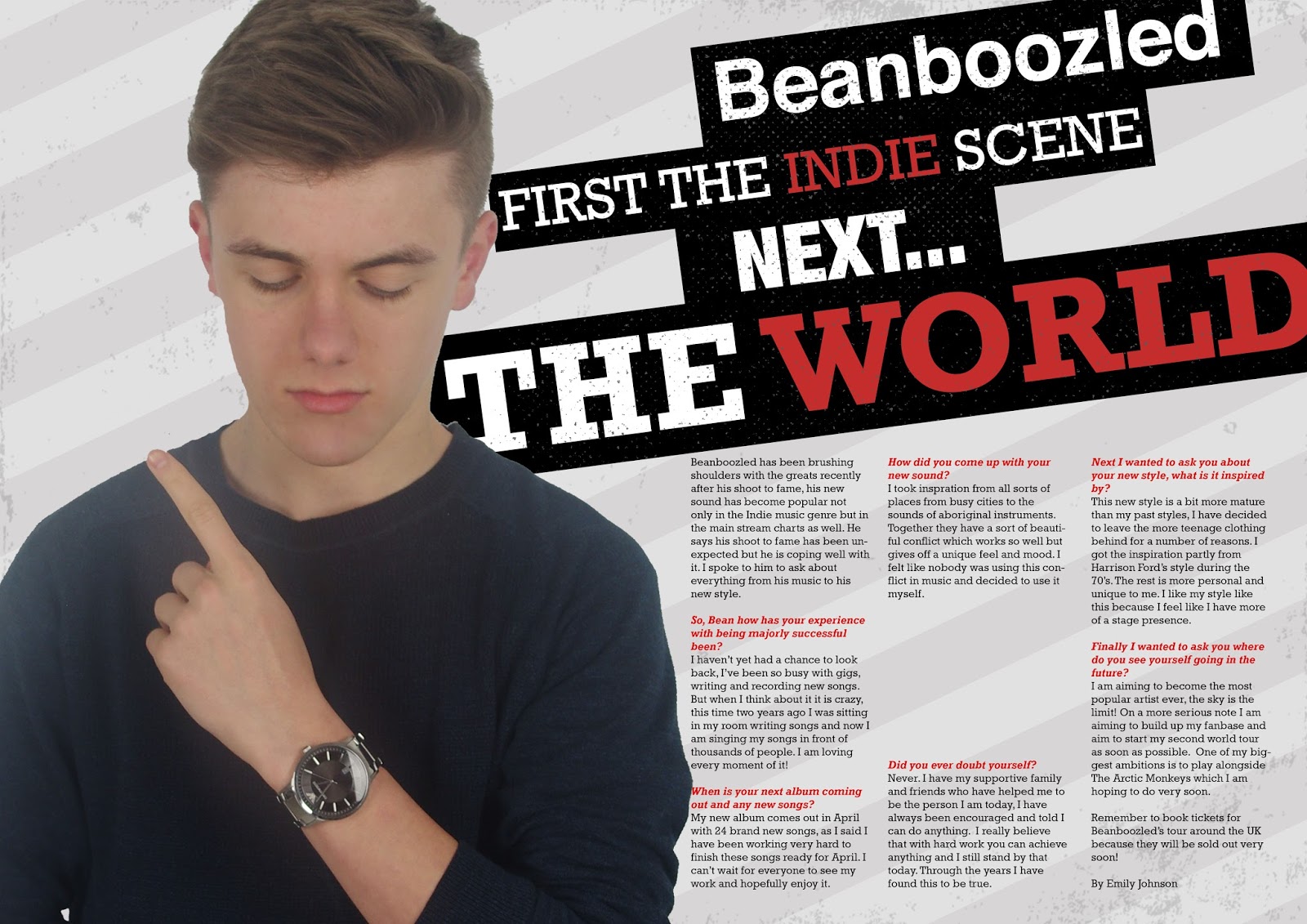
Final double page spread making process

Some processes will be put into one picture as they are simple or repetitive.


Contents Page Making Process

Some processes will be put into one picture as they are simple or repetitive.


Tuesday, 12 April 2016

Draft Evaluation 7

Looking back at your preliminary task (the school magazine task), what do you feel you have learnt in the progression from it to full product?

My magazines vary hugely because I have learnt more skills, techniques and conventions over time which will have increased the quality of later magazines compared to older versions. The skills I have learnt since the preliminary completely change the look and style of my magazine designs for the best.


Mise en scene and camera work
Firstly looking at the framing you can see the huge improvement, the College magazine has the subject too far back leaving far too much white space however the Vine's subject is closer and makes for a more interesting looking magazine. White space makes the reader think subconsciously that the magazine is not as full and therefore not worth buying another reason against having the subject framed improperly and in this case too far away is that the reader does not see the subject's features well and would not feel as much of a connection with them. Secondly since the preliminary magazine I have learnt a lot about mise en scene and how to style my model the right way. The preliminary magazine's model was photographed in his own clothes that he happened be wearing however I learnt that this can cause problems as the clothes may not be right for the genre I am shooting for which in this case is indie/alternative. In my final magazine I chose a dark green parka for my subject to wear because it is alternative and would attract the right audience. I chose a second outfit for him too which was a shirt for the contents page and a jumper for the double page spread these were all indie outfits. I learnt from looking at other magazines to vary the models clothing to keep the content original and interesting rather than the same thing from different angles. The backgrounds on my magazines vary hugely, my preliminary magazine uses a very simple white background and my final magazine uses a black background with stars on top to make it look like the model is in space. The simple white background is boring unless it is filled with something else and all of the pictures used in the preliminary magazine have white backgrounds making the whole thing rather boring to look at and could lose the readers attention however once I had researched other successful magazines I realised I needed to vary the setting more to keep the readers attention. In my final magazine I used different settings which made the magazine a lot more interesting and more balanced rather than just black and white with very limited colour. Next I changed the lighting more often rather than just using the studio and the light boxes to get a perfect lighting effect I used natural light in some pictures to get a more natural look to the magazine and to give a certain feeling to a band for example if the band/artist are more peaceful and innocent looking I would take a picture around nature however if the band is more 'hardcore' I would use a more urban setting which is a bit darker. The poses my models used have changed very slightly as I have learnt how much this can change the look and perception of the artist, as you can see on the 'College' magazine the subject has a slight smirk which makes him seem more playful and would not be taken as seriously however my final magazine model is completely serious so he would be taken seriously as an artist and because he is playing to a persona. On my first magazine the photoshop skill was not very good as the spot healing brush was used improperly and made the subjects skin look unnatural however the final magazine uses the spot healing tool well and although the skin still looks slightly unrealistic it is far better than the first attempt. I learnt a lot about using photoshop in the time making these magazines and I believe it shows through in the final piece.


Preliminary photos above and final pictures below


Text layout and other graphics

The magazines vary hugely in how they are presented, the text layout makes a huge difference in the look and general feel of the magazine. My preliminary magazine uses a more hectic and full cover page style which uses different sizes of text as well as different colours. The way the text is lay out is not perfectly aligned on purpose to give the magazine a hectic look which also makes it look full which makes readers think the magazine is full of content. I got the hectic look partly from NME's cover pages and the rest was my original idea, I chose not to bring this to my final magazine because I wanted to follow convention and have a more simplistic magazine that would suit my target market. My final magazine uses simple style which I learnt how to make by researching other indie/alternative magazines. On my contents pages I learnt that I needed to make my final version more busy and interesting which I think I managed well however the preliminary contents page is very poor and looks unprofessional.

Monday, 11 April 2016

Draft Evaluation 6

What have you learnt about technologies from the process of constructing this product?

Camera
For the photographs I used the Canon 1100D it produced the best image. The test images I took with it were impressive with great quality and a crisp look. The impressive images indicated that I should use the camera for my final photo shoot which will be crucial to the success of my magazine because if the images are poor customers will not want to buy the magazine. I had to find the right settings to get the right look I wanted and I also decided I could get a better picture by taking it portrait for the cover page so there is less white space wasted.

Lighting and other
For some of my pictures I used artificial lighting to get the best effect and light the subject nearly perfectly. I used two or three light boxes depending on the effect I was going for. I used a white background to make the models stand out more on the front of the magazine and to make it easier to cut the subject out from the background in Photoshop.

Photoshop
I used Adobe Photoshop CS6 and CC to make my magazine. My photo editing skills were definitely improved by the continued use of the program and I got better and faster. I learnt how to cut out pieces of images such as people with different tools; how to use layers; how to improve how pictures look and using fonts the right way. I learnt how to use nearly all the tools on offer and feel like I improved on what I knew before I started this project.


Online sites and other programs
I used many different websites and programs to produce my magazine. Firstly I used Blogger to create my coursework blog where I put everything I have done and used as well as research to show in an easily accessible way. I used iMovie to make a pitch for my magazine which I had not used properly before so it was very educational using it. I uploaded my pitch to YouTube, I had never uploaded or used YouTube from the creator end before so this was a good learning curve. I used Google to find images and research as well as finding fonts with Google Fonts or 1001 Fonts. Finally I used UK Tribes which was brilliant for helping me work out which groups to target and which not to.


Pictures of me using the studio to take photos


Draft Evaluation 5

How did you attract/address your audience?

The front cover of a magazine is the main way that the magazine attracts people because it is what they see on shop shelves so it is the most important page of the magazine. It has to sum up the magazine and attract the right audience. I designed my magazine to be simple but bold so it is easily readable from a distance and there is not too much that would confuse or overwhelm a potential buyer. I saw in many indie music magazines such as Loud and Quiet or NME that they were simple but bold so I decided to follow that convention to attract the right audience. The simplicity is very different from mainstream magazines and would attract the right audience that enjoy being different and like different things. The image I used on the cover page also captures the eye of the possible reader because of the intense eye contact and the costume which would attract an indie audience. Overall I believe my magazine would attract the right audience well with all it's features and style.
Focusing on the masthead I got inspiration from 'Clash' another music magazine that uses a very bold font for it's masthead. I used this type of masthead because I believe the name of the magazine should be the most important thing on the page occasionally behind the subject of the main picture but in my magazine I decided that the masthead had to be the most important part which is because if it was published would be a new magazine and the name would need to be remembered by the audience. I decided to put a thick outline on the masthead to really emphasise it's importance, because the masthead is on a black background I decided to use only white on the cover page for the text this makes the mast head stand out even more.

The cover lines on my cover page are big and stand out because they need to be easily read by the potential buyer to see what is inside the magazine. I used white for all my text so it stands out on the black background and the dark green coat. The font I used (Rockwell) is great because it is a serif font and is more interesting than a sans serif font this is breaking convention because most magazines use simple sans serif fonts but I think it will attract more people because the target audience enjoys different products so this would cater to that need. I positioned my main cover line in the centre to grab the main attention of the reader
The main image of the model on the cover page is very important to getting the attention of the reader if not the most important. To cater for the target market my model is wearing a vintage style parka and his hair is styled in a stylish way with a small bit drooping at the end which is different and could attract the alternative audience. The audience may see the magazine as a way of looking for new fashions to aspire to so the costumes of the models are very important.

Contents page
On my contents page there are many different techniques I used to attract the attention of the reader. Firstly I put the most important things in yellow which makes the reader look there before anywhere else, I would assume they opened the magazine (if they are not regular readers) for the artist Beanboozled and his page number and title is highlighted as well as a badge advertising a competition for tickets to a festival which could definitely grab the attention of the reader. The amount of pictures I used are purely so the reader does not get bored with just text and are there for entertainment and to add to what the text says. The title of the contents page is inside a black box and then a white box which makes it stand out and look different to other magazines. I used a busy contents page to show the magazine is full of information and entertainment and not just sparse. Just by looking at this page the customer should be able to tell whether they want to buy this magazine or not so I made it very interesting and full.
Double Page Spread
I got inspiration from Q magazine with the big watermark letter, I think this grabs the attention of the reader because it is unusual and adds some excitement visually to the page which would otherwise just be black and white text. My audience likes things that make magazines and everything different so this letter would make the magazine feel different and they would enjoy this. The title bending around the B is the same as it is unique and against convention. I am using the rockwell font again for the titles and the B and a simple sans serif font for the main body of the text following convention so it is easier to read. The serif font adds some art to the page making it more interesting. The picture on the double page has no eye contact which is not a problem as it is not the cover page. The style is simple just as the target audience like and may aspire to look like. However the framing on the picture has left too much white space which could be boring for the reader and that must be fixed. Overall my contents page would be considered interesting and the reader should enjoy it.